
Recently in Google IO 2015, Matias Duarte in Material Now session announced the release on Android Design Support Library. Android Design Support Library is basically for adding quick Material Design Views to your android app. And also this views are backward compatible upto Android 2.1. Android Design Support Library is a big relief for developers who wanted to implement Material Design to their apps. So today, we will be looking at a simple component of android design support library and that is Floating Action Button.
Download Project
Step 2. First thing to be done is adding the dependencies. So open the build.gradle file and add the following line in dependencies.
Step 3. Now open colors.xml in res => values directory. If it does not exists then create one with the same name. After opening the file, add colors resources as given below.
Why The Hell We Use Floating Action Button?
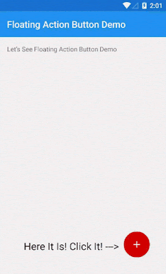
Floating Action Button specifies primary action of the app. We can specify what action will be performed when the Floating Action Button is clicked. And another reason to use it is that it looks great with the apps interface.What will it look like?

Steps To Add Floating Action Button
Step 1. Open Android Studio and create a new blank project by navigating to File => New Project and then fill other details.Step 2. First thing to be done is adding the dependencies. So open the build.gradle file and add the following line in dependencies.
dependencies {
    compile fileTree(dir: 'libs', include: ['*.jar'])
    compile 'com.android.support:appcompat-v7:22.2.0'
    compile 'com.android.support:design:22.2.0'
}
Step 3. Now open colors.xml in res => values directory. If it does not exists then create one with the same name. After opening the file, add colors resources as given below.
<?xml version="1.0" encoding="utf-8"?>
<resources>
    <color name="colorPrimary">#2196F3</color>
    <color name="colorPrimaryDark">#1976D2</color>
    <color name="colorAccent">#D50000</color>
</resources>
Step 4. Now open styles.xml in res => values directory. After opening it, add these styles to it.
<resources>
    <!-- Base application theme. -->
    <style name="AppTheme" parent="Theme.AppCompat.Light.NoActionBar">
        <!-- Customize your theme here. -->
        <item name="colorPrimary">@color/colorPrimary</item>
        <item name="colorPrimaryDark">@color/colorPrimaryDark</item>
        <item name="colorAccent">@color/colorAccent</item>
    </style>
    <style name="CustomToolbar" parent="ThemeOverlay.AppCompat.Light">
        <item name="android:textColorPrimary">@color/white</item>
        <item name="android:textColorSecondary">@color/white</item>
    </style>
</resources>
Note: The drawable used for FAB can be downloaded from the download link at the top.
<RelativeLayout xmlns:android="http://schemas.android.com/apk/res/android"
                xmlns:app="http://schemas.android.com/apk/res-auto"
                xmlns:tools="http://schemas.android.com/tools"
                android:layout_width="match_parent"
                android:layout_height="match_parent"
                android:orientation="vertical"
                tools:context=".MainActivity">

    <android.support.v7.widget.Toolbar
        android:id="@+id/toolbar"
        xmlns:app="http://schemas.android.com/apk/res-auto"
        android:layout_width="match_parent"
        android:layout_height="?attr/actionBarSize"
        android:background="@color/colorPrimary"
        app:popupTheme="@style/ThemeOverlay.AppCompat.Light"
        app:theme="@style/CustomToolbar"/>


    <!--This is the Floating Action Button's code-->
    <android.support.design.widget.FloatingActionButton
        android:id="@+id/fab_view"
        android:layout_width="wrap_content"
        android:layout_height="wrap_content"
        android:layout_alignParentBottom="true"
        android:layout_alignParentRight="true"
        android:layout_marginBottom="20dp"
        android:layout_marginRight="20dp"
        android:src="@drawable/ic_plus_white_36dp"
        app:backgroundTint="@color/colorAccent"
        app:elevation="5dp"
        app:fabSize="normal"/>

</RelativeLayout>
There are some specific attributes for Floating Action button:
- app:fabSize - These attribute is used to defined the size of the Floating Action Button. There are two value for these. First is app:fabSize="normal" for normal sized FAB and second is app:fabSize="mini" for mini size FAB.
- app:backgroundTint - These attribute is used to define the color of the Floating Action Button. Normally, accentColor is used for these but you can change it to anything.
- android:src - These attribute is used to define the drawable for the FAB.
- app:layout_anchor, app:layout_anchorGravity - These attributes are used to place FAB relative to other views in a particular position. In below example, app:layout_anchor is used to point to view it will relate to and then app:layout_anchorGravity is used to change the gravity of the FAB.
Example Code<android.support.design.widget.FloatingActionButton android:layout_width="wrap_content" android:layout_height="wrap_content" android:src="@drawable/ic_discuss" app:layout_anchor="@id/appbar" app:layout_anchorGravity="bottom|right|end"/>
Example Output
- app:elevation - These attribute is used to elevate the FAB.
Step 6Step 6. Next, open the MainActivity.java file . Once opened initialize the FloatingActionButton and then set click listener to it as shown below.
package com.jake.aditya9172.floatingactionbuttondemo;

import android.os.Bundle;
import android.support.design.widget.FloatingActionButton;
import android.support.v7.app.ActionBarActivity;
import android.support.v7.widget.Toolbar;
import android.view.View;
import android.widget.Toast;


public class MainActivity extends ActionBarActivity {

    @Override
    protected void onCreate(Bundle savedInstanceState) {
        super.onCreate(savedInstanceState);
        setContentView(R.layout.activity_main);
        //Initializing Toolbar
        Toolbar toolbar = (Toolbar) findViewById(R.id.toolbar);
        setSupportActionBar(toolbar);
        //Initialize FloatingActionButton
        FloatingActionButton fab = (FloatingActionButton) findViewById(R.id.fab_view);
        //Setting OnClick Listener to The Floating Action Button
        fab.setOnClickListener(new View.OnClickListener() {
            @Override
            public void onClick(View view) {
                //Do Something Code Goes Here
                Toast.makeText(getApplicationContext(),
                "You Clicked FAB! You Are FABulous!",
                Toast.LENGTH_SHORT).show();
            }
        });
    }

}
Step 7. Now as you have added all this code to your project, you can now watch the Floating Action Button in action. Go on and Run your Project.
There are more Material Design components in Android Design Support Library which will be posted in near future.
No comments:
Post a Comment